Aisha Munye
A2 Media Blog
Music Video
Initial Ideas -Album Cover

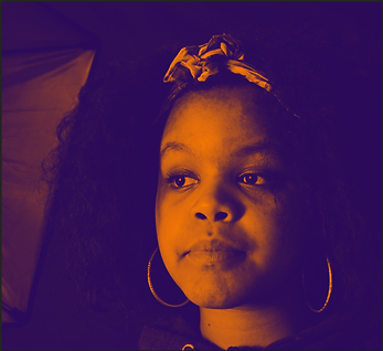
In my digi pack I used this particular,format for my whole album theme as I loved the colours, portrayed due to my artists style. However I do think my album does not show the youth side, of my artist because we hardely see the artist's face in this shot to to sell her image as a young edgy female artist. Also the whole aspect of my album looks to sophisticated and classical, which dosent show her fun urban demeanor. The colours shown in the album gives a dark eccentric look, which also over shadows the orange sepia on her face. I do think this colour scheme dosen't quite well link with my artist style or theme. However I have learned that the album cover sells the artists name, as well as her individual style which I should have showned thoroughly so my audiences know what they are buying.
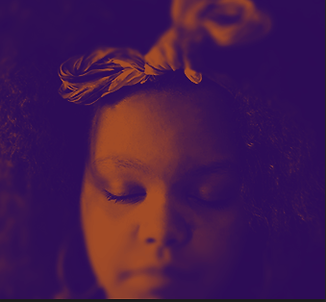
The reason why I have chosen to change this colour and format, is becuase I personally don't like it and it goes against the codes and convenion of a RnB genre. The close up and headband was one of the other reasons why I changed the whole aspect of my digi pack as a whole is becuase it does not show her style and edgyness what so ever so I wanted to add something discreet to make her look different and simple.